

How To Pull Off The 70/30 Design Rule

Imagine what it would be like to hire a professional interior designer to revamp your entire home. But wait, you just remembered, you’re working with a tight budget. It’s okay, you don’t have to give up on the dream of having a designer look, you just need to know how to play by the rules. (The design rules that is.)
One of the more popular rules in the design world is the 70/30 rule. At its core, the 70-30 split is a guideline that directs the user to devote 70% of a space to one style, color, or theme. Then, the remaining 30% showcases something different. This division creates a balanced, visually appealing aesthetic and helps beginners achieve a more designer look.
Making your home look and feel like it has a designer touch doesn’t have to be overly complicated. The interior design realm uses several rules that offer various benchmarks and pointers to craft a beautiful space. The 70/30 rule is a great place to start.
Determining How To Use The 70/30 Rule In Your Space
If you’re just getting your feet wet when it comes to designing your home, you don’t have to learn about all of the design rules at once. It’s best if you start simply, with a general idea that helps get you started, and the 70/30 rule is a good beginning point.
The 70-30 split is a broader interpretation of the popular 60-30-10 rule, which suggests that 60% of a space uses a dominant color or style, 30% is a secondary element, and 10% is for accents and unexpected pieces.
When considering the 70/30 rule, first you need to know how these numbers translate to your space. You can measure square footage to get super precise or determine a ballpark figure using a quick visual assessment.
However, remember, this 70/30 split applies to the entire space as a whole, including the elements you put into it. It isn’t like all the walls and the floor and ceiling are 70% and your decor choices are 30%.
Overall, once you have a good feel for the size of your space and its contents, you’ll devote 70% to a dominant style, palette, or theme. Then, you’ll bring in accents, various textures, different colors, or an entirely different style throughout 30% of the space.
Maintain Visual Harmony When Creating Your 70-30 Split
When implementing the 70/30 rule, it’s essential to keep another critical design rule in mind, and that’s balance. Imagine the entire room as if it's sitting on a see-saw. Ideally, the see-saw is level, with neither side dropping down or rising up.
This doesn’t mean that both sides of your room need to match; there’s nothing wrong with a little asymmetry. However, you do want to achieve equal visual weight so one side of the room doesn’t feel heavier than the other. When this happens, the room starts to feel off-kilter and will look askew no matter how stylish the elements are.
Therefore, as you choose what your dominant color or style is, spread it throughout the space, don’t focus it all on one side or in one spot. Likewise, when incorporating your secondary style choices in 30% of a room, disperse these elements in various places.
Different Ways To Apply The 70/30 Design Rule
Now that you understand the basic concept of what the 70/30 rule is, take it a step further. The most basic application of this rule is using a dominant color in 70% of a room and a secondary color in 30% of it.
For example, you might use light neutrals, like ivory and cream on the walls, ceiling, and a few furniture pieces. Then, you use a bold orange area rug, a few terra-cotta throw pillows, and some matching rust-colored decor to make up 30% of the equation.
But color isn’t the only way to apply the 70-30 split in your home’s design. Here are a few other examples of how to apply this rule when you’re creating and styling a space.
1. Solids And Prints
Mix and match solids and patterns in different ways. For example, solid colors on the walls and furniture, but bold patterns on accent pieces, curtains, rugs, and artwork. Or, flip it and have a dramatic wallpaper balanced with solid-colored window treatments and throw pillows.
You can also use one print in 70% of the space and a different print in the other 30%. If you want to use the same color in an entire space because you’re going for a monochromatic scheme, mixing patterns provides visual interest.
2. Smooth And Rough Textures
Texture makes a big difference in a space, and it’s something that all professional designers use and understand (at least the good ones). Different surfaces create more interest and various textures invite you to interact with a space, to reach out and touch things.
But using all one texture is boring. Decide on a few textures that you can use throughout the space you are designing. The 70-30 split is a good guide to keep things from going stale.
For example, in 70% of the space, use more nappy surfaces, like a jute rug, burlap pillows, and rattan furniture. Balance these rougher textures with more plush or smooth materials in the other 30% of the room. Suggestions would be a leather ottoman, a metal side table, and cotton drapes.
3. Lights And Darks
Pay attention to the various shades, tones, and tints of colors you use in a space to create a balance between light and dark. You get different shades of a hue when you add black to it, tones from adding gray, and tints by adding white.
Decide if you want 70% of the room to be light and 30% to be darker, or the other way around. Again, this is a suggestion, it doesn’t mean every space you design needs to have light and dark. Many spaces are beautiful yet use all moody, dark colors or bright, airy pastels. This is simply another suggestion of how you can apply the 70-30 rule.
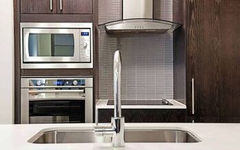
For example, you may use light wood furniture against a dark wall color, or opt for darker woods on a white tile floor. Many kitchens often showcase light cabinetry with dark countertops or light stone counters balanced with espresso cabinets.
4. Matte And Glossy Finishes
Another way to add visual interest to a space is by using different finishes on everything from paint to furniture. One of the most popular ways to do this is by using a satin paint finish for wall paint and choosing a semi- or high-gloss finish for doors and trim.
You can also balance shinier surfaces, like metallic hardware, with flat finishes on furniture. Changing up the finish is also a way to create visual interest in a monochromatic space. You decide if you’ll go 70% matte with 30% glossy accents or the other way around.
5. Full And Empty
When you design a room, if you’re going for a clean, streamlined look, empty space is your friend. This doesn’t mean you can’t have any accessories or have to go full-on minimalist. It just means, don’t fill every inch and corner.
In most cases, this means 70% of the room will have something in it, while 30% is free and clear. This rule is particularly key when you’re organizing spaces. An area looks more organized and tidier if there is negative space between shelves, between items, etc.
And, yes, in some cases, more space is better. For example, one common tip for making a kitchen look larger is to keep 70% to 75% of the countertops clear when you’re not using them.
6. Angles And Curves
Choose different edges for furniture, accessories, and even architecture to create harmony and interest. A few ways to do this are adding an oval coffee table atop a rectangular rug or pairing a curved sofa with a square end table.
You can also extend this mix of curves and angles to patterns on wallpaper, in rugs, and other accessories. If you’re unsure about the percentages, think of it this way — for every three angled furniture pieces, add one with a rounded, softer edge. This ratio helps keep a room from feeling too hard or too plush.
The 70-30 Rule Works In More Ways Than One
Keep in mind that as you strengthen your designer muscles, you can implement the 70-30 rule in multiple ways. For example, a 70% neutral color palette with smooth leather and metal surfaces balanced against 30% bold colors with woven, rattan furniture and burlap pillows.
Good design involves taking chances, but there are still a few design rules you shouldn’t break. Be daring, but pay attention to the big things, like space planning, functionality, lighting, and balance.
Related Guides:
- Five Characteristics Of Japandi Design
- Seven Characteristics Of Organic Modern Design
- Seven Distinctive Characteristics Of Traditional Design

Stacy Randall is a wife, mother, and freelance writer from NOLA that has always had a love for DIY projects, home organization, and making spaces beautiful. Together with her husband, she has been spending the last several years lovingly renovating her grandparent's former home, making it their own and learning a lot about life along the way.
More by Stacy Randall


![The 10 Best Table Saws - [2022 Reviews & Buyer's Guide]](https://cdn-fastly.upgradedhome.com/media/2023/07/31/9070645/the-10-best-table-saws-2022-reviews-buyer-s-guide.jpg?size=350x220)