

How To Choose The Right Color Scheme For Your Home

If interior design were an amusement park, then color would be the huge roller coaster that makes it famous. That is to say, color is one of the most powerful tools when it comes to design, having the power to make or break the entire aesthetic and mood of your space.
Use a color wheel to guide you when choosing a harmonious color scheme for your home. Consider how you use each space and how you want it to feel, then take into account natural and artificial light and in which direction each room faces. Think about things like contrast, depth, undertones, and balance. Always test colors, and choose hues that reflect your personality.
The colors you choose for your home should reflect your personality, but they also influence the overall mood. Whether you're renovating, redecorating, or just adding a fresh coat of paint, knowing how to choose the right color scheme is key to making your house feel like a home.
First, A Crash Course In Color Theory
Yes, it’s super exciting to grab fistfuls of color swatches from the paint store and dream of your updated space. But, hit the brakes. Before you start channeling your favorite HGTV star, you need to brush up on your color theory knowledge.
Don’t worry, you don’t need to enroll in any fancy design courses. You simply need to familiarize yourself with the basics, starting with the color wheel.
Getting To Know The Color Wheel
Want a helpful tool that makes choosing colors for your home easy-peasy? Then, get a color wheel. It’s worth the few bucks it costs to pick one up at your local art store or online. In a nutshell, a color wheel has three main categories.
| Color Categories | Colors |
| Primary colors | Red, yellow, blue |
| Secondary colors (created by mixing different primary colors) | Green (Yellow/Blue), Orange (Yellow/Red), Purple (Red/Blue) |
| Tertiary colors (combinations of primary and secondary colors) | Blue-Green, Red-Violet, Yellow-Orange, etc. |
You can use a color wheel to design a variety of color schemes. Colors that are next to each other on the wheel create analogous color stories. If two colors are opposite of each other on the color wheel, you get a complementary color scheme.
Triadic color schemes feature three colors that are evenly spaced on the wheel, while monochromatic rooms showcase various shades, tints, and tones of one color. You get shades when you add black to a color, tints when you add white, and tones when you add gray.
| Color Scheme | Location On Color Wheel | Examples | ||
| Monochromatic | One color in various differentiations | Blue, light blue, dark blue, darkest blue | ||
| Analogous | Side-by-side | Yellow and Green | Blue and Purple | |
| Complementary | Across from each other | Blue and Orange | Red and Green | Purple and Yellow |
| Triadic | Three colors evenly spaced around the wheel | Yellow, Red, Blue | Orange, Purple, Green | Yellow-Orange, Red-Violet, Blue-Green |
Consider The Purpose Of Each Room When Choosing A Color Scheme
Once you’ve wrapped your brain around color theory, it’s time to decide how to apply your newfound knowledge to adding color to your home. In your house, each room likely serves a specific function, maybe even more than one. Since another part of color theory is how color affects your mood, consider what you plan to do in a room when selecting your palette.
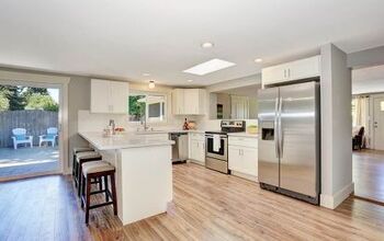
For example, living rooms are typically social spaces, so warm tones create a cozy and welcoming vibe. For a bustling kitchen, colors like white, gray, or even soft blues keep things feeling fresh and clean. But on the other hand, red can stimulate appetite if you prefer a bolder approach.
Relaxation is the usual goal in a bedroom, so it makes sense to go with a design that helps reduce stress. For this reason, cool colors like soft blues, lavenders, and greens are often top picks. Likewise, many people like to mimic a relaxing spa in their bathrooms, so peaceful hues are common (and they make small spaces feel larger and cleaner).
Pay Attention To Natural Light And Room Orientation
Lighting plays a huge role in how colors appear in your home (both artificial and natural light). You also need to think about which way your room faces.
| Room Orientation | Light | Color Picks |
| North-facing | Gets cooler light | Warm colors, like creamy white or warm gray, can balance cool tones |
| South-facing | Gets warmer light | Cool colors, like blue or green, to get a balanced look |
| East-facing | Bright in the morning, shadier in the afternoon | Pairs well with soft, warm hues |
| West-facing | Warmer, golden light in the evening | Warm light enhances warm, bold colors |
In rooms that don’t get much light, avoid overly dark colors that could make it feel too oppressive. Plus, the sun doesn’t stay up all the time, which is why you have to think about artificial lighting, too.
Building Your Color Story For Your Home
Think about creating a color scheme like building a house. You start with a solid, strong foundation, then you build on top of it to create an interesting, functional space.
Using a neutral foundation gives you more freedom and flexibility when choosing decor and can make other colors stand out beautifully. Common neutral colors include white, gray, taupe, beige, greige, ivory, and cream.
Then, you can add accent colors through furniture, art, textiles, or accessories. This makes it easy to switch up your color scheme seasonally or over time without a full redesign.
Choose A Connecting Color That Flows Through Your Home
Make your home feel cohesive by having a flow-through color that appears in every room in some way—whether on the walls, in accessories, or artwork. This doesn’t mean every room needs to be the same color. It just means choosing a specific color that continues through each room to help unify the entire space.
A popular way to introduce a flow-through color is with trim. People often paint the trim throughout their entire homes the same color to tie different color schemes together.
Use The 60-30-10 Rule For Your Colors
The 60-30-10 rule is a classic interior design principle that ensures balanced color distribution throughout a space. At its core, your main color dominates 60 percent of a space, usually on the walls and large furniture. Next, 30 percent of the area is a secondary color that’s brought in through upholstery, window treatments, rugs, trim work, etc.
Finally, the remaining 10 percent is for an accent color. You normally see this color throughout the space on things like throw pillows, décor pieces, art, and other small elements.
Extra Tips For Choosing The Best Colors For Your Home
First and foremost, your personality and what you love should influence the colors you pick for your home. Do you love the subtle, earthy tones of boho, pink and white patterns in a shabby chic room, or a classic black-and-white motif? A good clue for your favorite colors is often in your closet.
Draw Inspiration From Existing Elements
Use your existing furniture, flooring, or artwork to guide your color decisions. Look for commonalities, so you can keep an intentional look throughout your design and give your space a sophisticated look.
Test, Test, And Test
No matter what colors you lean toward, test them out first in the space. You can’t judge how a color is going to look in your home by how it looks under the harsh lights of the hardware store.
Get sample jars, and paint large swatches on several walls. Check out how the color changes throughout the day, in various lighting, and next to furniture and decor.
Pay Attention To Undertones
You don’t have to match colors, but it pays dividends to match undertones — the subtle hints of color beneath the surface. For example, whites can have blue, pink, yellow, or gray undertones. Maybe you’ve heard someone refer to a color as warm gray or cool gray and thought, “Isn’t it just gray?” The answer is a resounding, “Nope!” because of the differences in undertones.
Cool grays typically have bluish undertones, while warm grays have more brownish ones. Therefore, when selecting items and paint, choose options that share similar undertones to avoid clashing or getting an off-kilter vibe.
Don’t Forget About Ceiling And Trim Colors
The go-to for ceilings is typically white, which reflects light and makes rooms feel taller, but don’t be afraid to experiment. Match your wall color for a cozy, seamless look, or make a statement with a bold hue. Going a shade slightly darker than the walls adds subtle depth.
People usually like to paint trim a contrasting neutral so it pops against the wall color. This is also an excellent way to draw attention to intricate architecture and details. But you can also opt to paint the trim the same color as the walls to make a room feel larger.
Create Contrast And Depth Using More Than Color
Visual contrast isn’t just about using different colors. What if you prefer a monochromatic scheme or want to experiment with color drenching?
There are other ways to keep the look from falling flat. Use different finishes (matte, glossy), patterns (floral, geometric, stripes), and materials (linen, leather, rattan, wood) to create more interest.
Find A Color Scheme That Makes Your House A Home
Choosing the right color scheme for your home is a beautiful blend of science and art, but mostly, it’s about what you love. By understanding color theory fundamentals, knowing your space, and staying true to your individual style, you’ll reap the rewards of a harmonious home that’s beautiful and uniquely you.
Start small, test frequently, and always trust your instincts. The right color scheme transforms your home into a sanctuary that reflects your taste and enhances your everyday life.
Related Guides:

Stacy Randall is a wife, mother, and freelance writer from NOLA that has always had a love for DIY projects, home organization, and making spaces beautiful. Together with her husband, she has been spending the last several years lovingly renovating her grandparent's former home, making it their own and learning a lot about life along the way.
More by Stacy Randall


![The 10 Best Table Saws - [2022 Reviews & Buyer's Guide]](https://cdn-fastly.upgradedhome.com/media/2023/07/31/9070645/the-10-best-table-saws-2022-reviews-buyer-s-guide.jpg?size=350x220)